Dilemmatic design
Back in the Exun days, I went for my first web designing competition with DJ. It was a Saturday morning and we had to design a promo page for Windows Vista. I fired up Photoshop (this surprises some people, perhaps because ‘web design’ has very little to do with the words ‘photo’ and ‘shopping’), did some funky things to a sample image they gave us, created some glass-styled elements (I had just learnt how to – they were all the rage those days), whipped up some HTML, and we were done. An hour or so later, we were enjoying the sweet taste of victory.
Yet despite having been designing in some form ever since, I’ve never thought of myself as a designer (I’m a programmer, I tell you!). I enjoy reading about design and playing typography games. Heck, one of my favourite documentaries is about Helvetica (hush, the fact that I haven’t watched many has nothing to do with that!). I did a fair bit of design work for Exun, for Red Cross as the Publicity and IT Officer, for other societies and side projects, and for Roam7 (using GIMP, no less) while interning there. During my gap year after school, I even did a tiny bit of spec work on 99designs, which was a waste of time and led nowhere.
Nevertheless, design always comes with difficulty to me – I’ve often thought this might be because I lack any formal study. When I mentioned in the previous post that there was a reason behind my lack of writing here, this was one (there were actually two reasons – this was the lesser of them). I had once again found myself unhappy with the design of my blog. It sounds silly but I didn’t feel like writing because then I’d have to look at a design that I no longer liked.
Seriously, brain, time to grow up.
So I embarked on the redesigning journey for the umpteenth time. They say it’s much harder to design for yourself, and it’s true. I usually start by thinking about how I want the design to “feel”, accompanied by looking at other places for inspiration. Minimal designs have always appealed to me, and I stumbled across one I liked quite a bit (also, that article has a lot of useful information for web developers).
I started putting things together in Sketch (I switched from Photoshop to Pixelmator two years ago, but I haven’t used either in a long time). Sketch is great, but I ended up throwing away everything I made there – all I can remember is that I was using a screenshot of Rich Hickey’s “Are We There Yet?” talk as an image placeholder (watch that talk too, if you’re any kind of developer). I thought Sketch would help by getting me away from the actual blog, but making styling changes in it after you’ve come up with a basic layout is too much effort.
I moved to the Jekyll code, simplifying the blog’s existing HTML. After many iterations (mostly typographic), I came up with a layout that I was quite satisfied with.
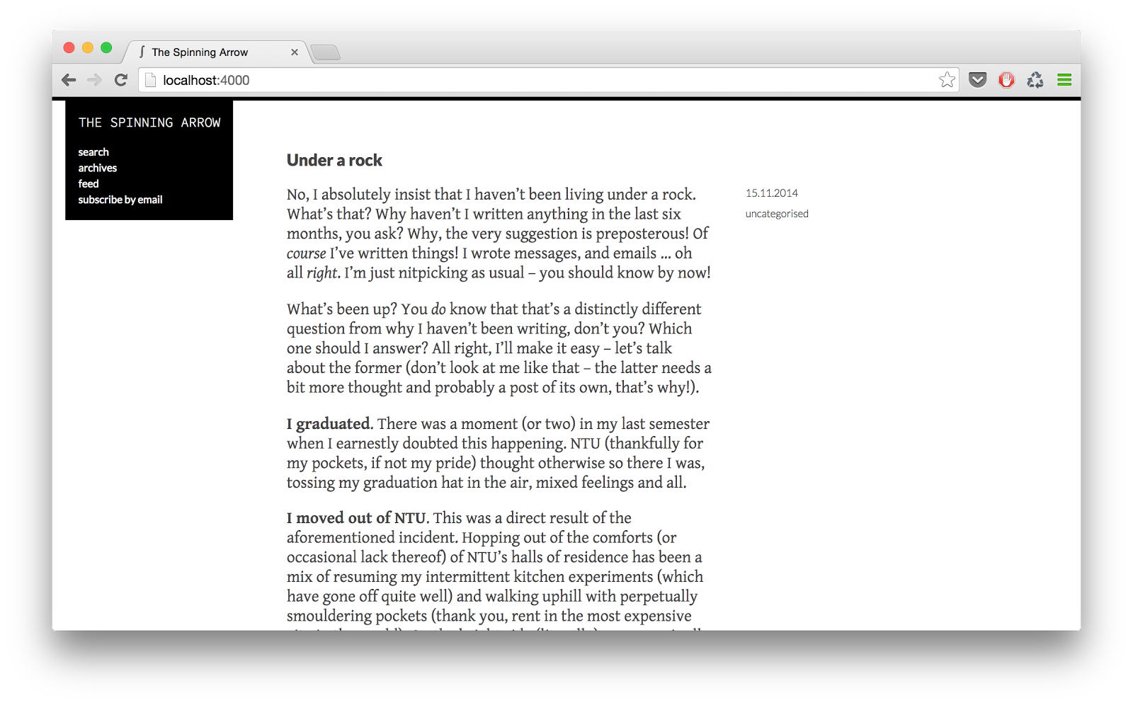
I let it mature for a bit – by now I’ve realised I end up disliking my stuff more often than not. The same fate befell that design within a few days – it went from “hmm, it’s not bad” to “…” to “gah I don’t like it, and I don’t like Gentium for the post body!”. It felt as if it were going somewhere, but wasn’t quite there yet.
Then, in another spurt of messing around, I suddenly saw something that just ‘clicked’. This was it! A few tweaks here and there – and the current layout was done!
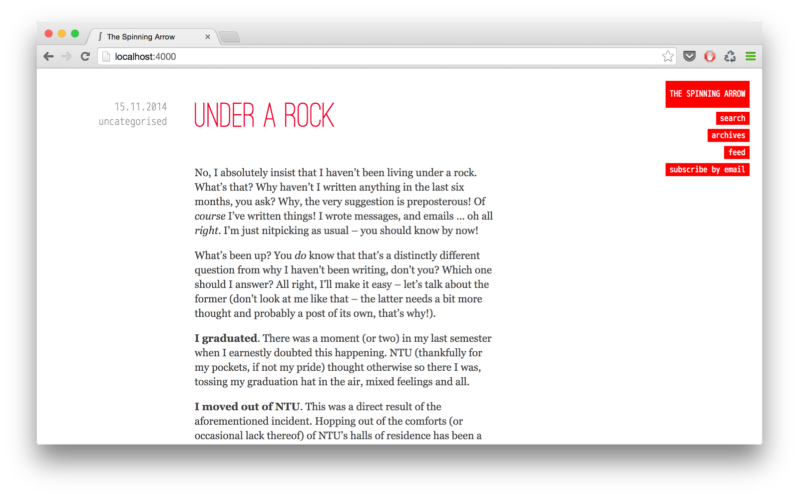
On the whole, I’m pretty happy with the current design. Note the use of monospace fonts – until now I’ve shied away from any tech influences on this blog, but this may actually be a whiff of other changes to come.
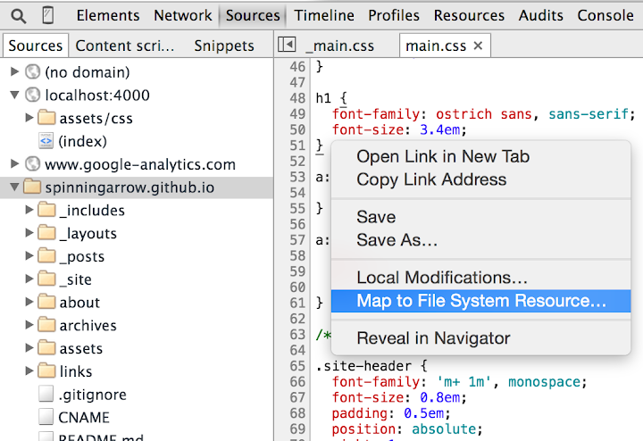
By the way, one of the things that really speeded work up this time was using Chrome DevTools’ workspaces feature – I often edit the CSS directly in the browser (instant feedback is really helpful) and this way I didn’t have to manually copy all the styles back to the source file.
I may never be a designer, but I still love design.
Comments
No comments.